RED SNACK — Kraft Pouch Label & Brand Accent

Intro
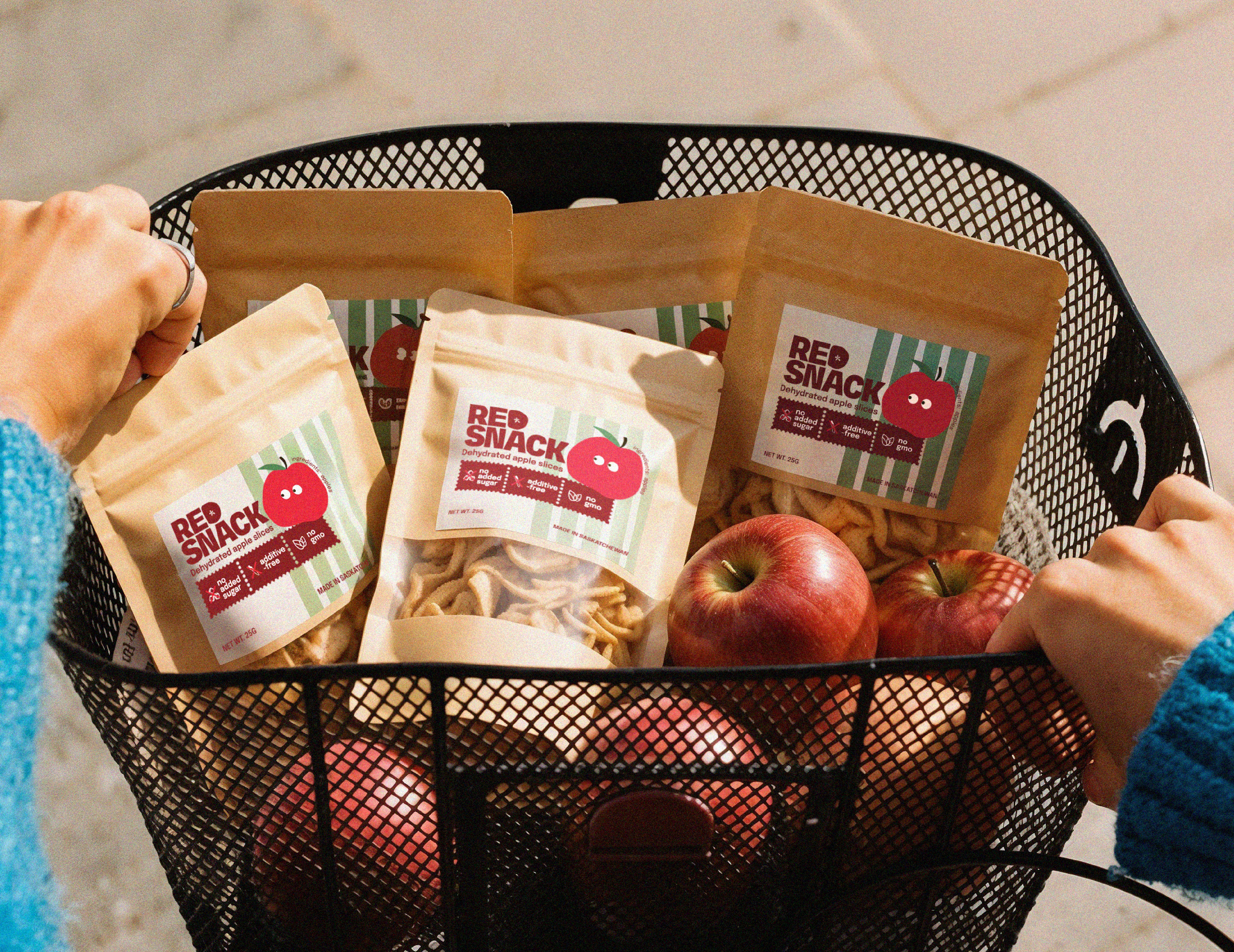
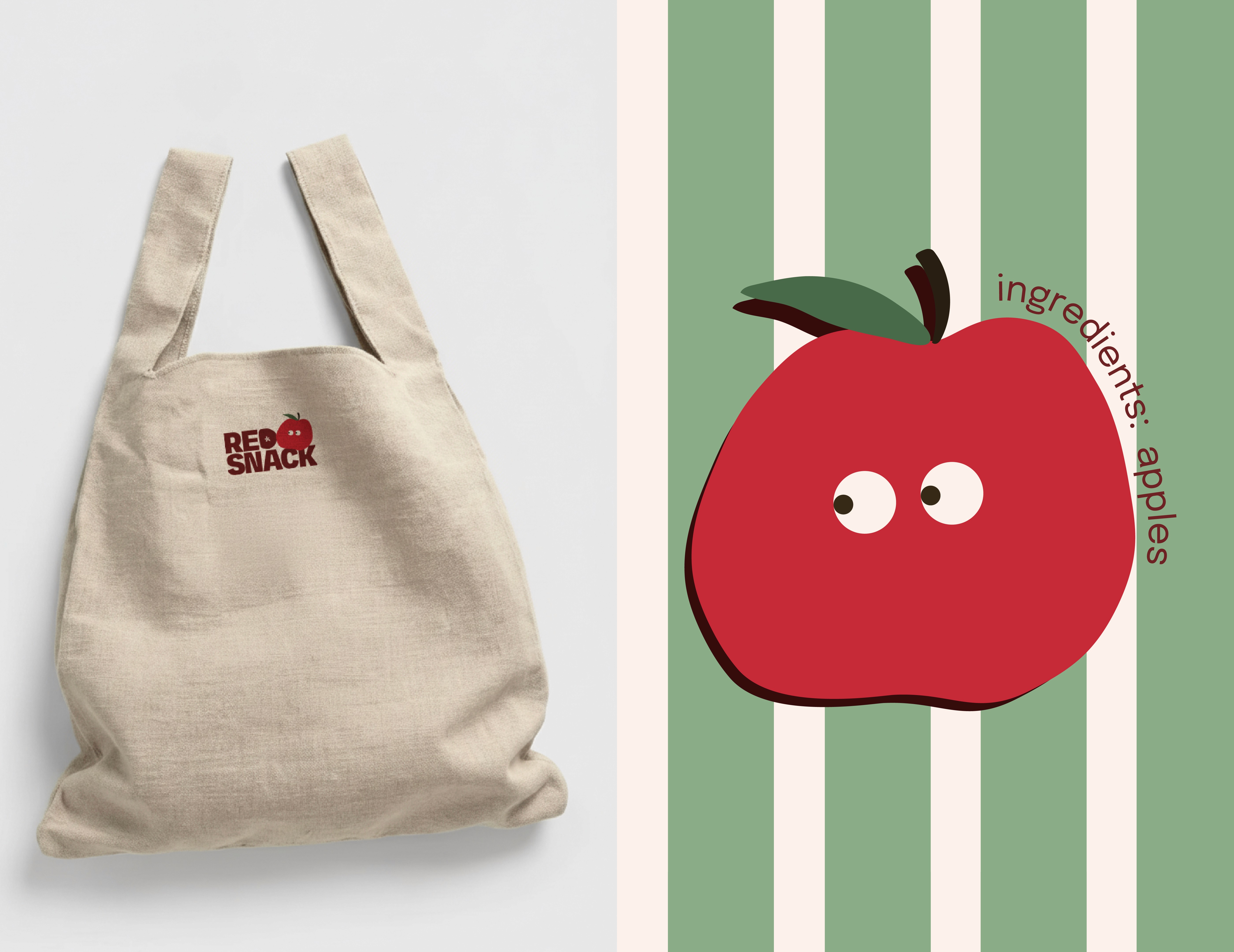
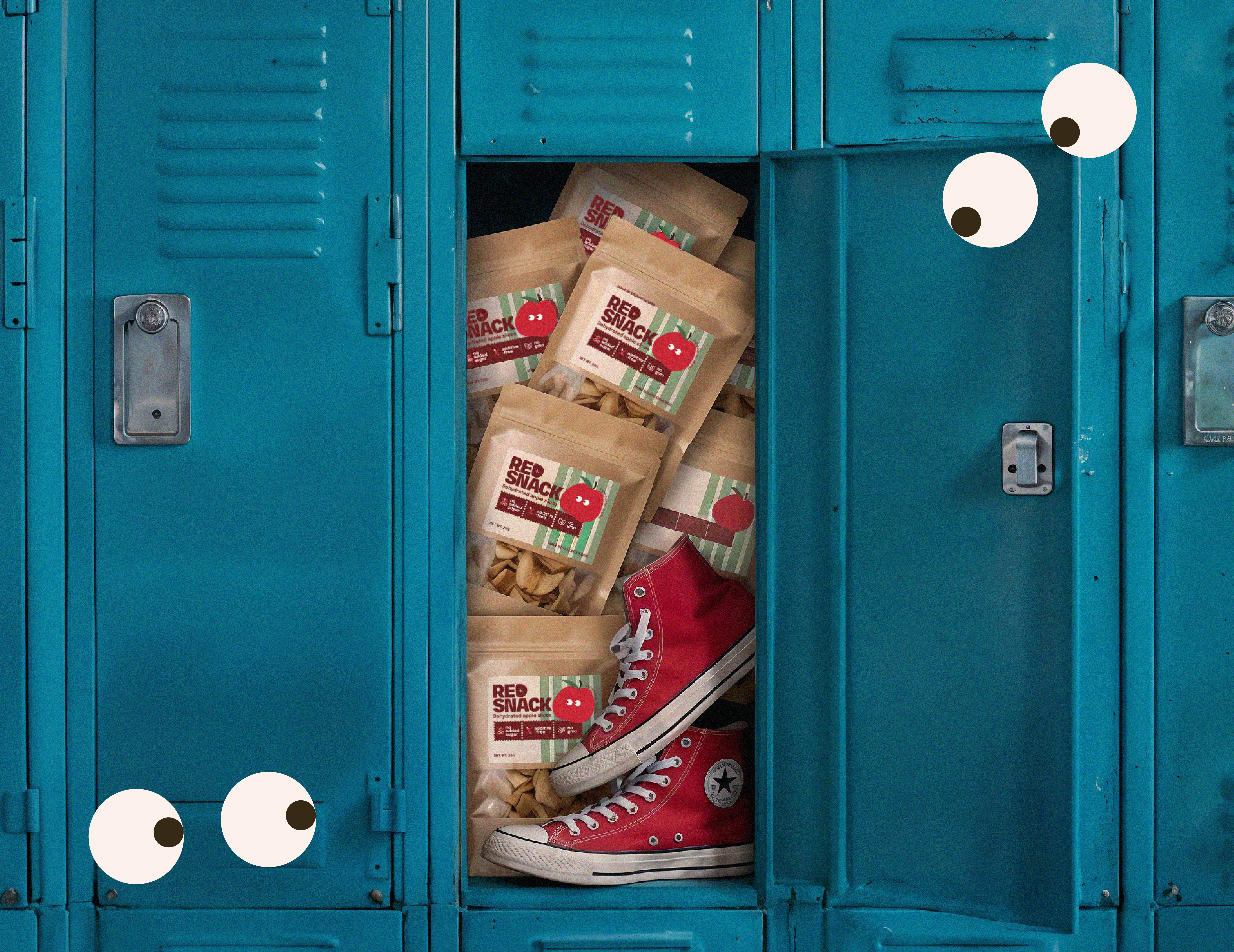
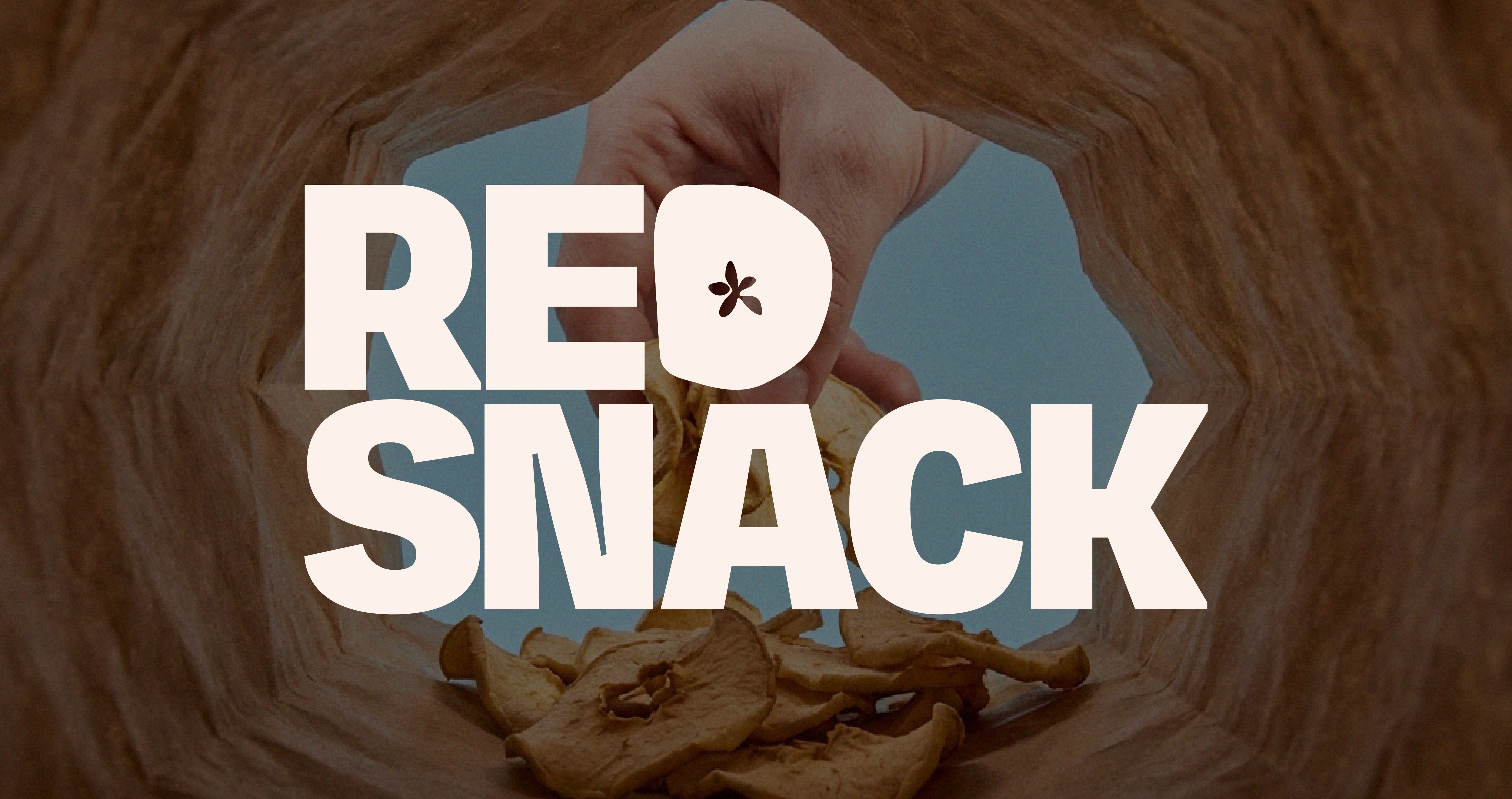
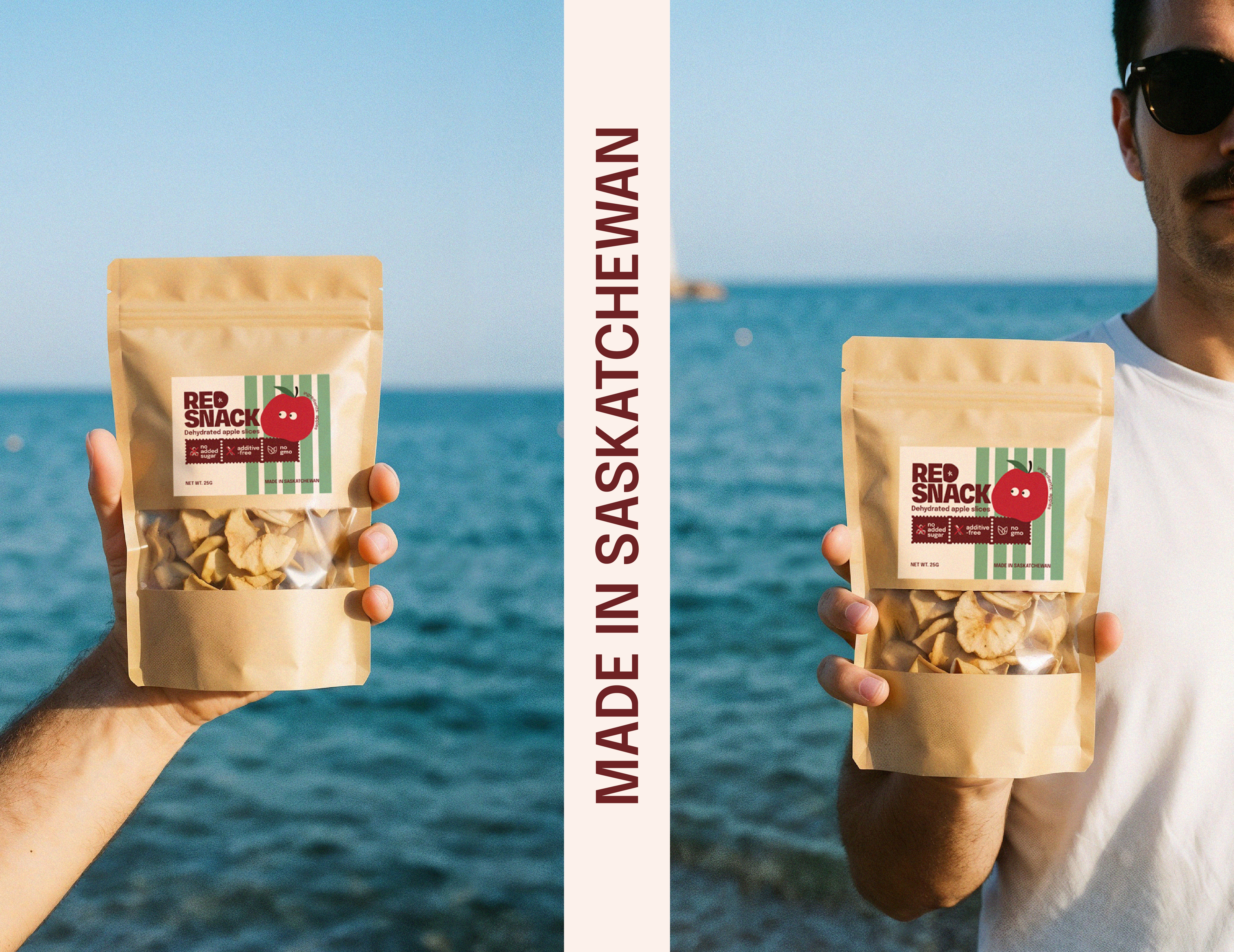
RED SNACK is a small homemade brand of dehydrated apples, and the goal was to make it feel alive, bold, and not generic. In this mini case, I designed a label for a kraft stand-up zip pouch — keeping the product simple and honest, while making the packaging look modern, fun, and full of character. Label concept: a mix of “homemade” warmth and a street-style vibe — a high-contrast logo, clean readable copy, a striped pattern for rhythm, and a tiny apple character as a memorable accent. The result is packaging you want to grab, throw into your tote, and snack on the go — no extra hype, just tasty. Result: one label that works like a recognizable “mood sticker” for the brand and can be easily scaled into other flavors/products in the future.
Deliverables:
Brand Strategy
Brand Identity
Packaging
Logo Design